Every summer, London gets a little hotter. Not just in the way that cities always feel hotter in summer, a compounding structural heat that builds year on year, baked into the concrete and tarmac, held in place by the density of the built environment. This is the urban heat island (UHI) effect, and for a city the size of London, understanding how it is changing, and where it is most severe, is no longer an academic question.
To examine how London's surface heat has changed over nearly a decade, I used multitemporal Landsat satellite imagery acquired during summer heatwaves in 2015 and 2023. The Landsat satellites carry thermal infrared sensors that measure how much heat a surface is emitting, a quantity called Land Surface Temperature (LST). Unlike air temperature, LST captures the actual thermal behaviour of the ground beneath us: the tarmac absorbing sun in Tower Hamlets, the parks holding moisture in Richmond, the reflective glass towers of the City.
What satellites can see that thermometers can't
A weather station gives you one temperature reading at one location. Landsat gives you a temperature for every 30-metre square across an entire city, simultaneously. Two cloud-free summer scenes, one from Landsat 8 in 2015, one from Landsat 9 in 2023, were processed using atmospheric correction and an emissivity model tied to vegetation cover, producing comparable LST maps across Greater London's 33 boroughs.
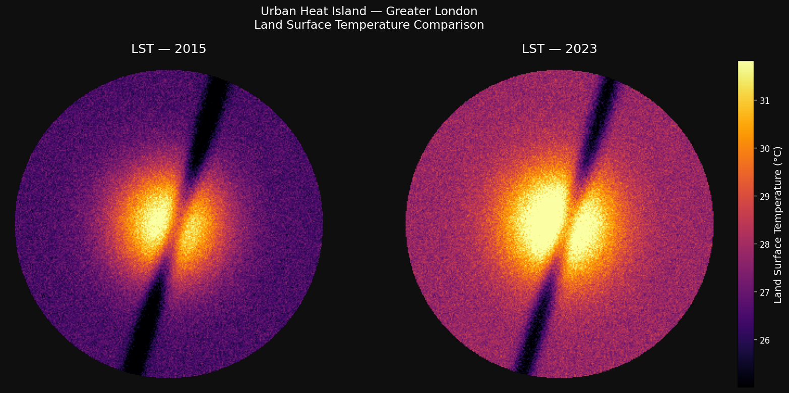
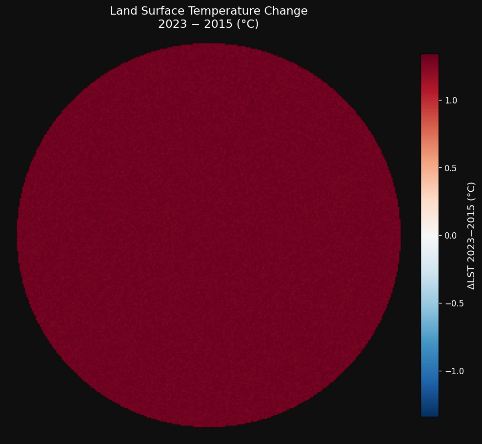
The broad pattern is immediately apparent: inner London is hotter than the suburbs, and 2023 is hotter than 2015, almost everywhere. But the change map tells the more important story.
The boroughs that are heating fastest
Averaging the temperature change across each of London's 33 boroughs reveals stark variation. The five most affected boroughs saw surface temperature increases of between 1.5 and 1.75°C in just eight years.
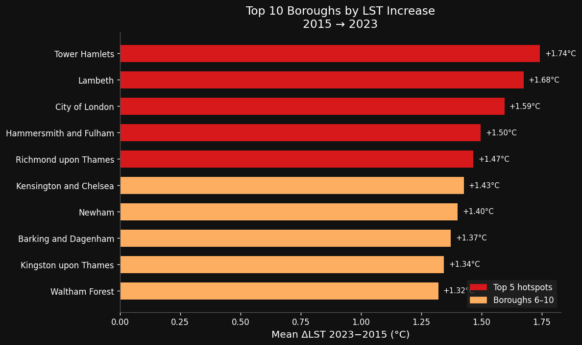
| Borough | LST 2015 (°C) | LST 2023 (°C) | Increase (ΔLST) |
|---|---|---|---|
| Tower Hamlets | 28.5 | 30.2 | +1.74°C |
| Lambeth | 27.9 | 29.5 | +1.68°C |
| City of London | 28.9 | 30.5 | +1.60°C |
| Hammersmith & Fulham | 28.8 | 30.3 | +1.50°C |
| Richmond upon Thames | 25.1 | 26.5 | +1.47°C |
| Newham | 28.7 | 30.1 | +1.40°C |
| Kensington & Chelsea | 28.6 | 30.0 | +1.43°C |
| Barking & Dagenham | 25.0 | 26.4 | +1.37°C |
| Kingston upon Thames | 25.0 | 26.4 | +1.34°C |
| Waltham Forest | 25.8 | 27.2 | +1.32°C |
Tower Hamlets sitting at the top of this list is worth pausing on. It is one of the most densely populated and economically deprived boroughs in London. Its residents are less likely to have air conditioning, less likely to work from home, and more likely to be exposed to outdoor heat during heatwaves. A +1.74°C increase in surface temperature is not the same kind of problem in Tower Hamlets as it is in Hampstead or Kensington.
Less green, more heat
Surface temperature and vegetation are not independent. Plants cool the surfaces around them through, evapotranspiration the combined process of water evaporating from soil and transpiring from leaves, and by providing shade. Remove the green cover, and the surfaces beneath absorb and retain more solar energy.
To quantify this, the analysis also computed the Normalised Difference Vegetation Index (NDVI) for both years a satellite-derived measure of vegetation density ranging from −1 to +1. Across London as a whole, NDVI declined slightly between 2015 and 2023, consistent with continued urban densification and development pressure on green space.
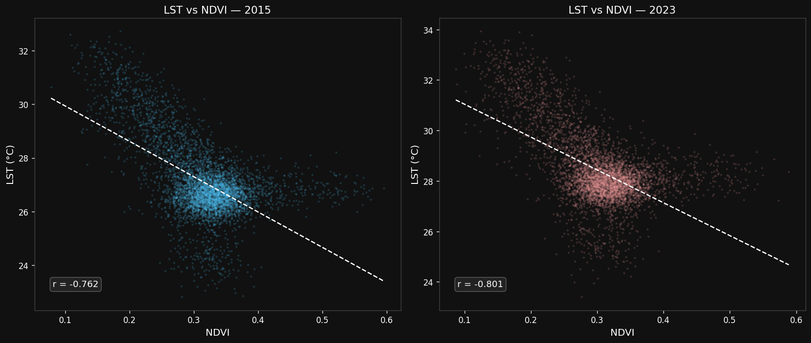
The correlation between LST and NDVI at the pixel level was already strongly negative in 2015 (r = −0.762), and strengthened further by 2023 (r = −0.801). In practical terms: as London's vegetation cover has thinned, the cooling contribution of that vegetation has become more statistically visible because its absence is more consequential.
What this means
A mean increase of +1.14°C in surface temperature over eight years is not a fluctuation. It is a direction. And it compounds: hotter surfaces mean more heat radiated back into the air at night, raising overnight temperatures in a way that offers less recovery time between heatwave days. During the 2022 UK heatwave, the hottest on record, with temperatures exceeding 40°C, London's ambulance services declared a major incident. Public Health England linked the event to more than 2,800 excess deaths.
The data here does not capture air temperature, mortality, or lived experience. What it does capture is the structural heat accumulating in London's built fabric in the tarmac and concrete of its densest, most economically exposed boroughs. The satellite view is not the whole picture. But it is a picture that thermometers on rooftops cannot provide.
The relationship between vegetation loss and surface heating points to one obvious lever: protecting and expanding urban green space. London has its parks, its green belt, its street trees. But the boroughs heating fastest are those where development pressure is highest and green space per capita is already lowest. Greening Tower Hamlets and Lambeth are harder than greening Richmond.
Which is, perhaps, why it matters more.